Wednesday 29 February 2012

More Designs on Croquis.

After working on the manicans we then had to make designs from the shapes created on the manicans. These are some of the designs I created.


These were created from a shape taken from heshin on the manican. I espically like the bottom design of the top. I think it's interesting and fits the body well.

These were created from a shape taken from poly-cotton on the manican. I think the design of the two shoulder pieces is really interesting as it completely changes the silhouette of the body.

Working with materials.

We had to pick three materials, a heavy weight, a light weight, and a medium weight. I picked..

Heavy weight: Heshin.
Medium Weight: Poly-cotton.
Light Weight: Netting.

I found the netting to be too stiff for a light weight so I used Organza as a second lightweight material.

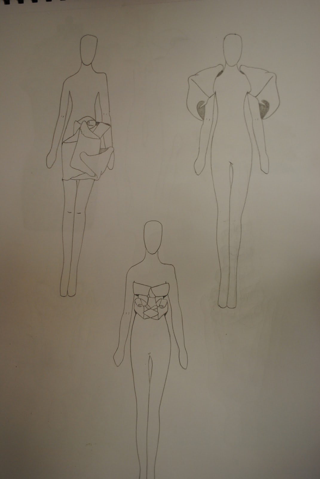
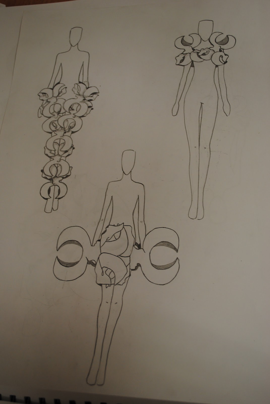
Again we cut out our shapes using different sizes, only this time we cut them out of different materials instead of paper. It was interesting to see how the materials work on the stand compared to paper. I found paper was easier to manipulate, but at the same time it was much more delicate and crinkled alot easier.
It was also interesting to see how the materials differed to eachother when placed on the manican. I found the light weight materials were harder to manipulate than the heavy weight material. I also thought the light weight materials look alot more delicate and flimsy as the draped.
My favourite matierals to work with were the Poly-cotton and the netting. I found both had enough stiffness so you could manipulate them to create certain shapes,but at the same time they looked delicate and flimsy as they draped slightly.

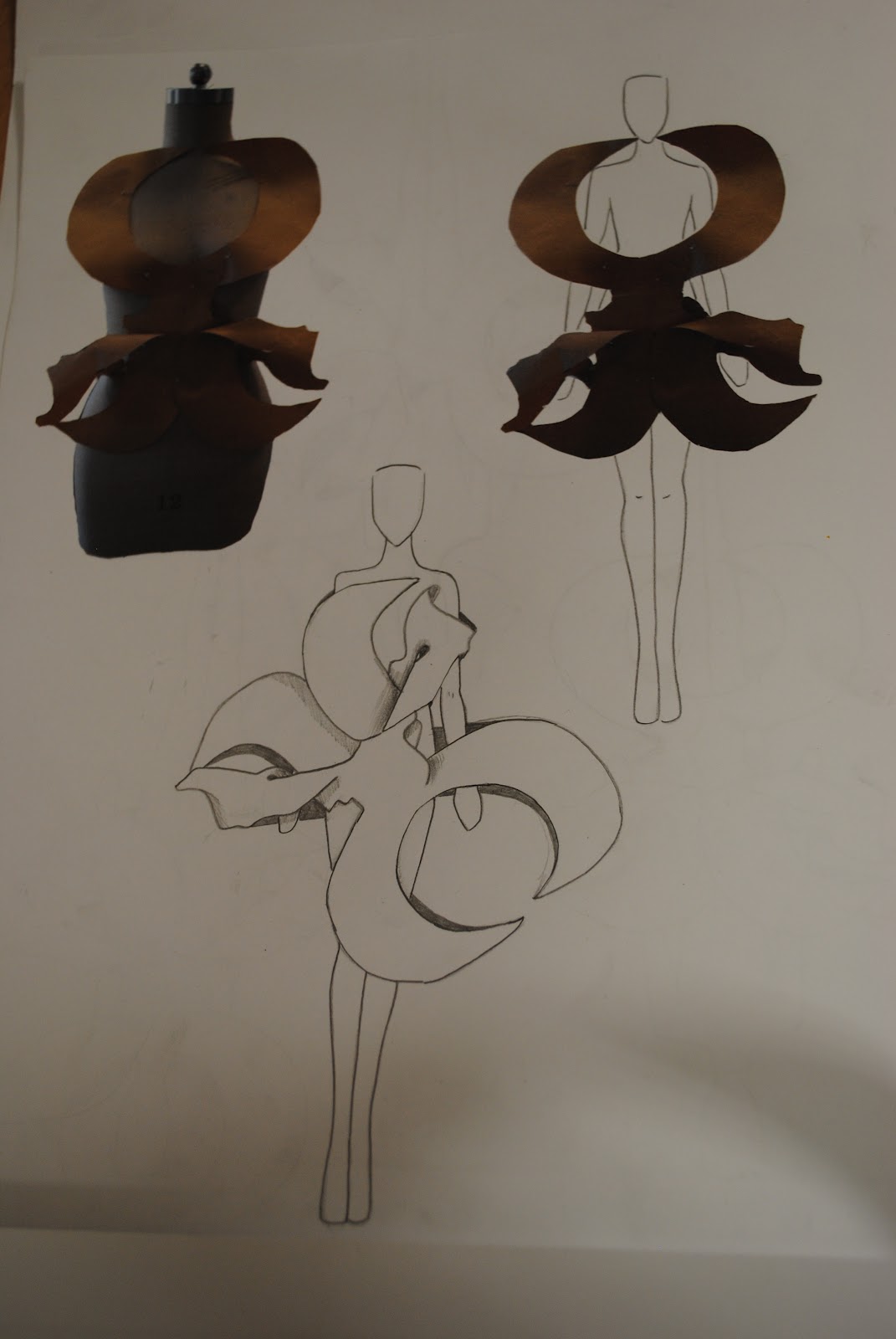
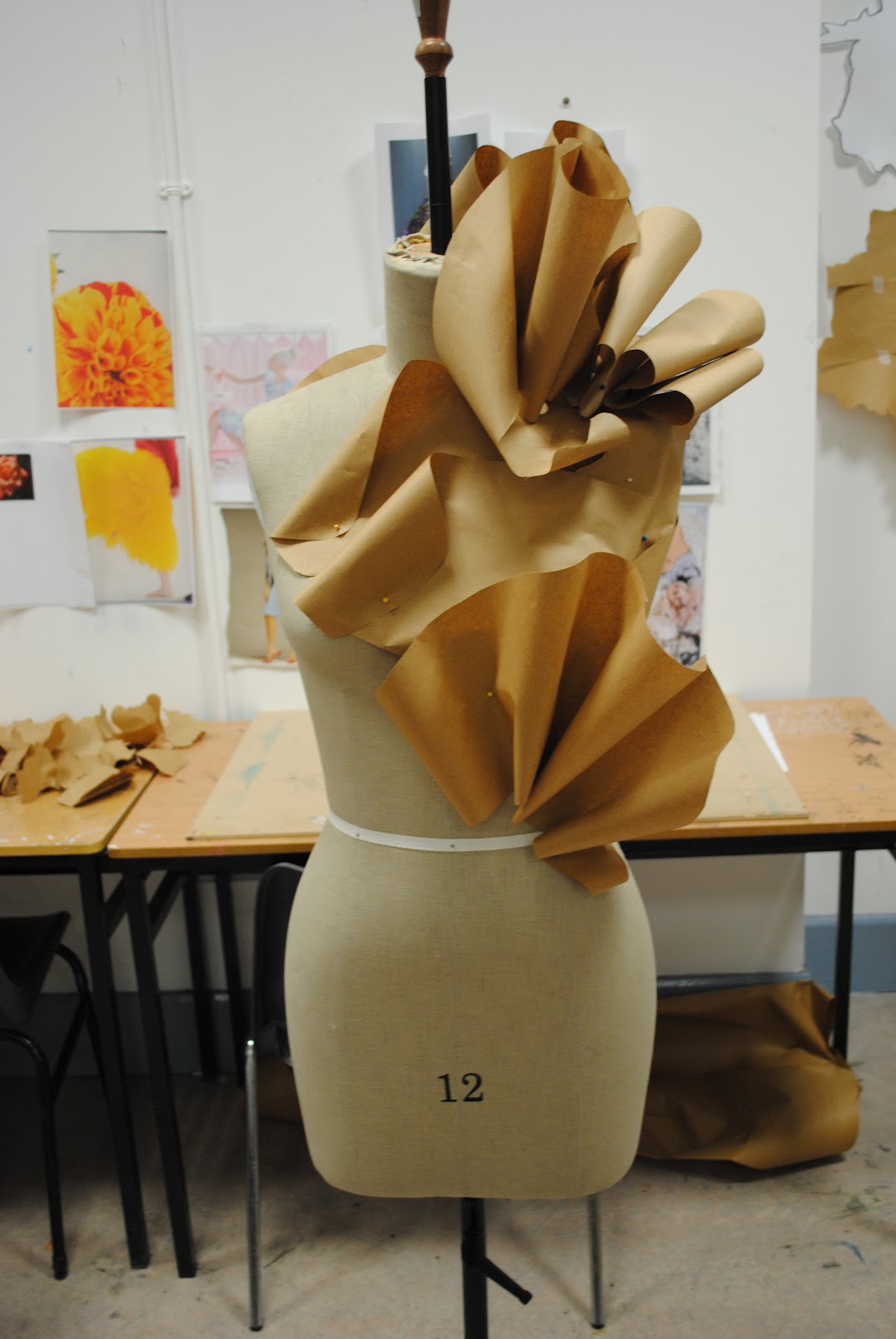
These are some of the designs I created on the manican with materials.
 Heavy weight: Heshin.
 Medium Weight: Poly-Cotton.

 Light Weight: Organza
 Light Weight: Netting.


This was made using a combination of Poly Cotton, Heshin and Netting.

Some Designing..

After I placed the brown paper on the manicans I began drawing designs from their shapes on croquis. Creating a good croquis was difficult as the proportions of the body were hard to get exact. In the end though, I was very happy with my croquis. It's a simple croquis but it looks safisticated and garmends fit well on it.

These are some of the designs I came up with from the shapes I created on the manican.

I really like the trousers design I created from this shape.


I think these designs worked great as they fitted the body very well.


I think these designs also fitted the body very well. I like how they change the silhouette of the body.

Shapes, shapes and more shapes :)


We had to select two of these shapes. I selected these two shapes. We then had to cut them in different sizes out of brown paper.


We then used the brown paper shapes to make various designs on the manican. These are just some of the many designs I made from the brown paper shapes. I found manipulating, twisting and folding the paper to create different shapes really interesting.


Saturday 25 February 2012

FASHION!! :)

Flimsy/etheral/fuzzy ???

Plenty of words and ideas were comming to mind while I did a mindmap of these words in work. ...but working in a chinese, I just couldn't keep my eyes off the decorative chinese knots hanging on the walls.


I took pictures of these and began researching them on the internet. I then picked the most appealing ones and did detailed sketches of them.


After sketching them I pulled as many shapes as possible out of the sketches. I was very shocked as I came up with a wide range of shapes.

Thursday 9 February 2012

more apples!!

With this idea I want to shape the pips of the apple into a heart. This is the most literal and simple of my ideas but I think it works the best.


idea number 2 :)


I loved this idea but after doing it, I realised it didn't really express the meaning of the metaphor. Anyway, my idea was to resemble a bunch of flowers someone would give to ''the apple of their heart.'' Instead of flowers I decided to use apples. I played alot with these photos in photoshop and came up with some really good images.

illustration..

After alot of brainstorming and thumbnail sketches I came up with three ideas to represent the metaphor 'the apple of my heart'. My first one is again inspired by how people carve love hearts into trees, I then started thinking of how they carve and place fancy decorations onto apple tarts. This idea was very simple and literal, but I thought it worked well. I got photos of an apple tart, a cut out heart, and a picnic table cloth, and merged them into one using photoshop.

Typeography

I came up with three final ideas for my typeography..


I'm not sure which I'll go with yet. My first piece is just simple curly type with them 'M' altered to portray a heart. My second piece is a plan to take the words 'apple of my heart' and photoshop them onto an apple sticker. My third is the words 'apple of my heart carved into an apple in curly, romantic type, and then photoshopped. This was inspired by people carving love hearts and their enitals into trees.

Sunday 5 February 2012

Carving apples :)

I tought of how people carve love hearts and their enitals into trees. I wanted to do abit of a pun on this, so I carved the metaphor into an apple...

The apple of my Heart

For our project we were given a metaphor. For the first week we had to convey the message of the through type. The metaphor I got was the ''apple of my heart''. I did some research and brainstorming to really try and figure out the meaning of this metaphor. To me it means the thing you love, more than anything in the world. Conveying this meaning through type was not as easy as it seems! I did the metaphor using numberous types and fonts.