
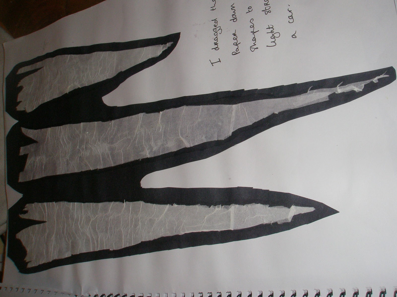
I zoomed in on this picture to get the image for my print


 I decided to just to trace one of my mono-prints and I came up with a really cool line drawing so I said I'd pop it in here.


 using black paper....
 using fairy liquid on cling film....


 I first tried this using wax. I put coloured thread through the wax pieces. The colours I used represents the car lights. I wanted the piece to imitate the colour of the car light (thread) shining through the glass that protects it (wax). I think these turned out really well. The delicasy of the wax reflects the delicasy of glass. I think the coloured thread comming through the wax look really well.
 I then made ice sculptures of the shapes. I made these sculpures smaller as I think they seemed more delicate.
 I wanted to incorporate print into my project! Of course I left it till last minute, so the first thing I thought of was potatoe prints. Doing this was loads of fun and I actully really like the way they turned out!
 I was researching and came across these artists that do 'light graffiti'. >>>>>>>>>>>>>>>
 When I was taking pictures of my clay light boxes I accidentally moved the camera and got a stream of light comming from the boxes. This looked really like a car light..Bingo! :D I decided to do this using different ways to create my light.
 Here I used two flash lamps and just swang them around the room like a crazy person! Because I used two and they were white I thought the really looked like the headlights of a car.

 <<Emroidery thread on black and white paper
 I was taking photos of cars passing on a wet road. One photo in particular I thought had amazing colours from car and street lights. In this piece Donald maier made car lights illuminate on the page by using pastels.
 I tried to do this too using pastels from a photo I took of the traffic on Clare street.

 I went to the felt work shop that was on at the beginning of the year and made felt for the first time. I loved making felt and knew straight away I had to incorporate it into my project. On the day of the workshop I made different pieces of felt using the colours of carlights.


 I realised just a small amount of colour or pastel like, simple colours looked better than bright colours all thrown together. It made it all a little less chaotic and made it all about the shape.


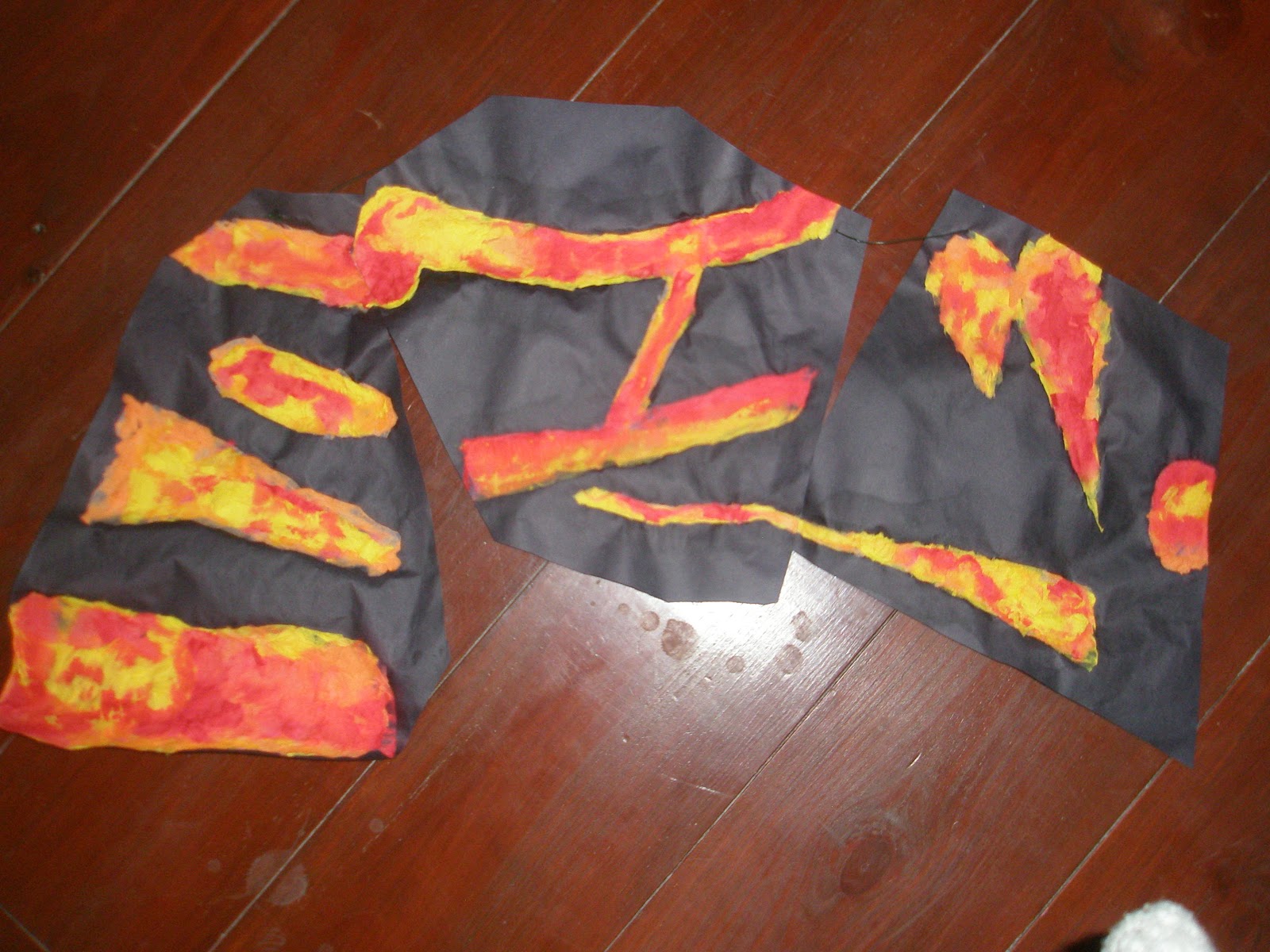 I did three seperate pieces of the shapes of the car lights in crepe and pva. I joined them so one shape would blend into another, like the way car lights blend into eachother.